Computer and Information SciencesQuarto

dataand.me

Mara Averick's posts, notes, and talks on open-source, data science, and data visualization featuring R.
Home PageRSS FeedMastodon
language
RData VisualizationComputer and Information Sciences
Published
Author Mara Averick

My relationship with reading borders on pathological (and by “borders on” I mean “has literally been a topic of discussion in therapy”). I mean, I’ve gotten it under control somewhat —we’ll use my 2014 Goodreads Reading Challenge as a bar for a bit out of control—which means I can take a look back on my 2021 year in books without too much self-recrimination.
YadmDotfilesComputer and Information Sciences
Published
Author Mara Averick

I recently got a new laptop (see Making the M1 leap if you’re curious how that journey went), and in so doing, got lots of great advice about how other developers set up their machines. The award for biggest game-changer, though, has to go to Patrick Schratz who introduced me to yadm (Yet Another Dotfiles Manager). Here, I’ll give you a quick rundown of what yadm is, how to get started with it, and why I think it’s so darn cool.

RData VisualizationAccessibilityHighcharterHighchartsComputer and Information Sciences
Published
Author Mara Averick

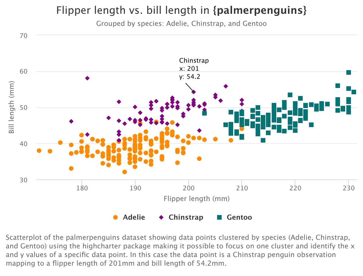
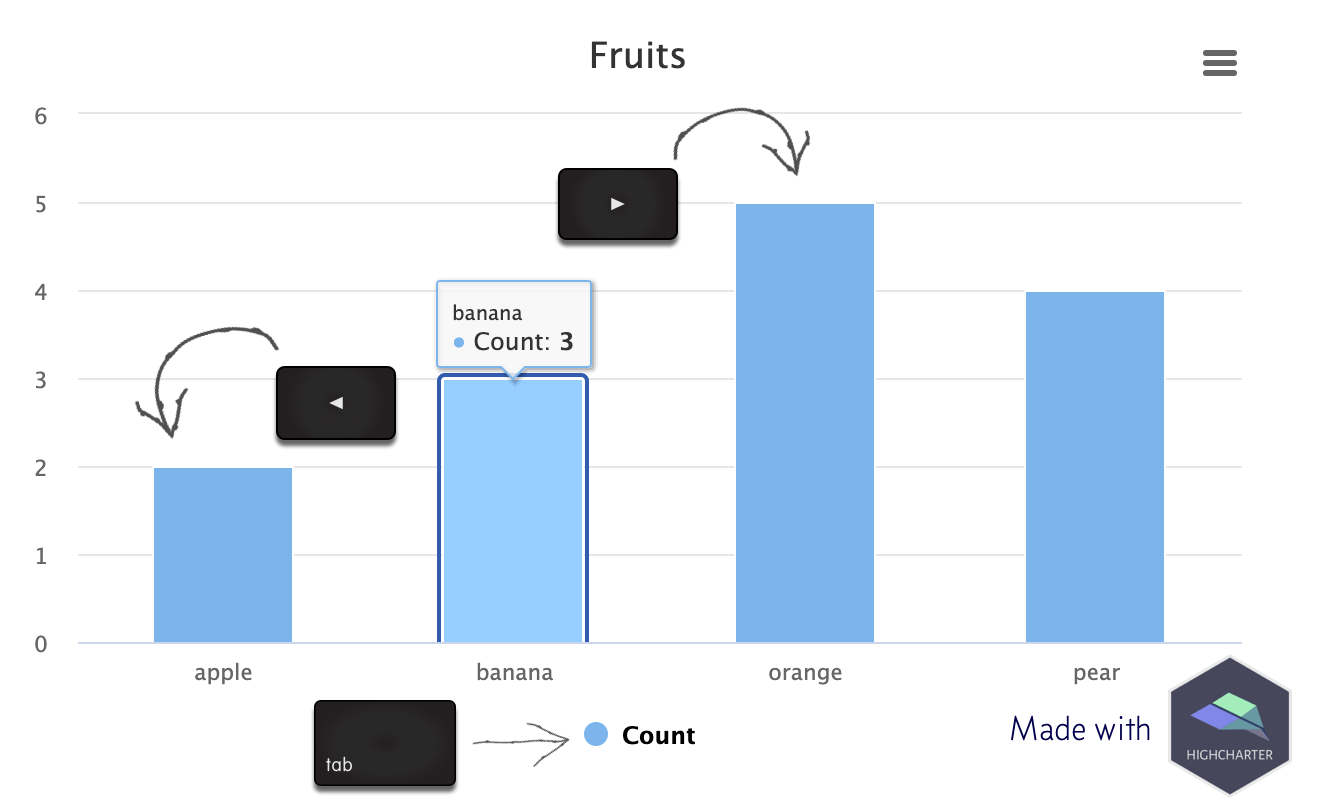
This final installment in our series on using the Highcharts accessibility module with {highcharter} is basically “extra credit.” (Read: I took the time to figure this out, so I’m sharing it. But, it’s probably not the most helpful post if you’re just trying to get the accessibility module working with {highcharter}.) We covered enabling the accessibility module, and getting basic keyboard navigation in part one.

RData VisualizationAccessibilityHighcharterHighchartsComputer and Information Sciences
Published
Author Mara Averick

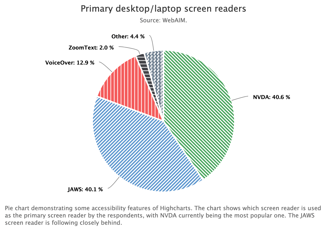
Back in the first post in this series I mentioned that the impetus for this whole endeavor was Silvia Canelón’s excellent collection of R-specific resources for making data visualizations more accessible (Canelón 2021). I wanted to fill the gap between the possibilities afforded by Highcharts’ accessibility module, and documented examples of module use with the {highcharter} package (Kunst 2021). Don’t worry, I have pull requests in the works

RData VisualizationAccessibilityHighcharterHighchartsComputer and Information Sciences
Published
Author Mara Averick

In the first two parts of this series we introduced the Highcharts accessibility module, the {highcharter} R package, and created some working examples with accessibility features turned on. Here, we’ll follow in the vein as part 2 by re-creating one of the accessible chart demos from Highcharts.

RData VisualizationAccessibilityHighcharterHighchartsComputer and Information Sciences
Published
Author Mara Averick

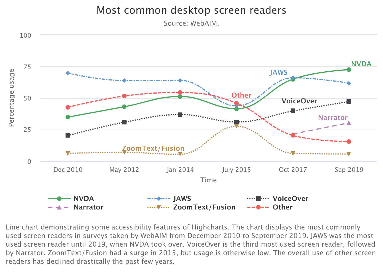
Today we’ll be using the Joshua Kunst’s {highcharter} package to re-create the first example from the Highcharts documentation for its accessibility module, an accessible line chart showing screen reader popularity over time, as an htmlwidget.