Social ScienceQuarto

Data Art & Science Blog

Exploring the art and science of working with development and humanitarian data
Home PageRSS Feed
language
Data VisualizationRainfallTidyverseGgplot2Ridgeline PlotSocial Science
Published

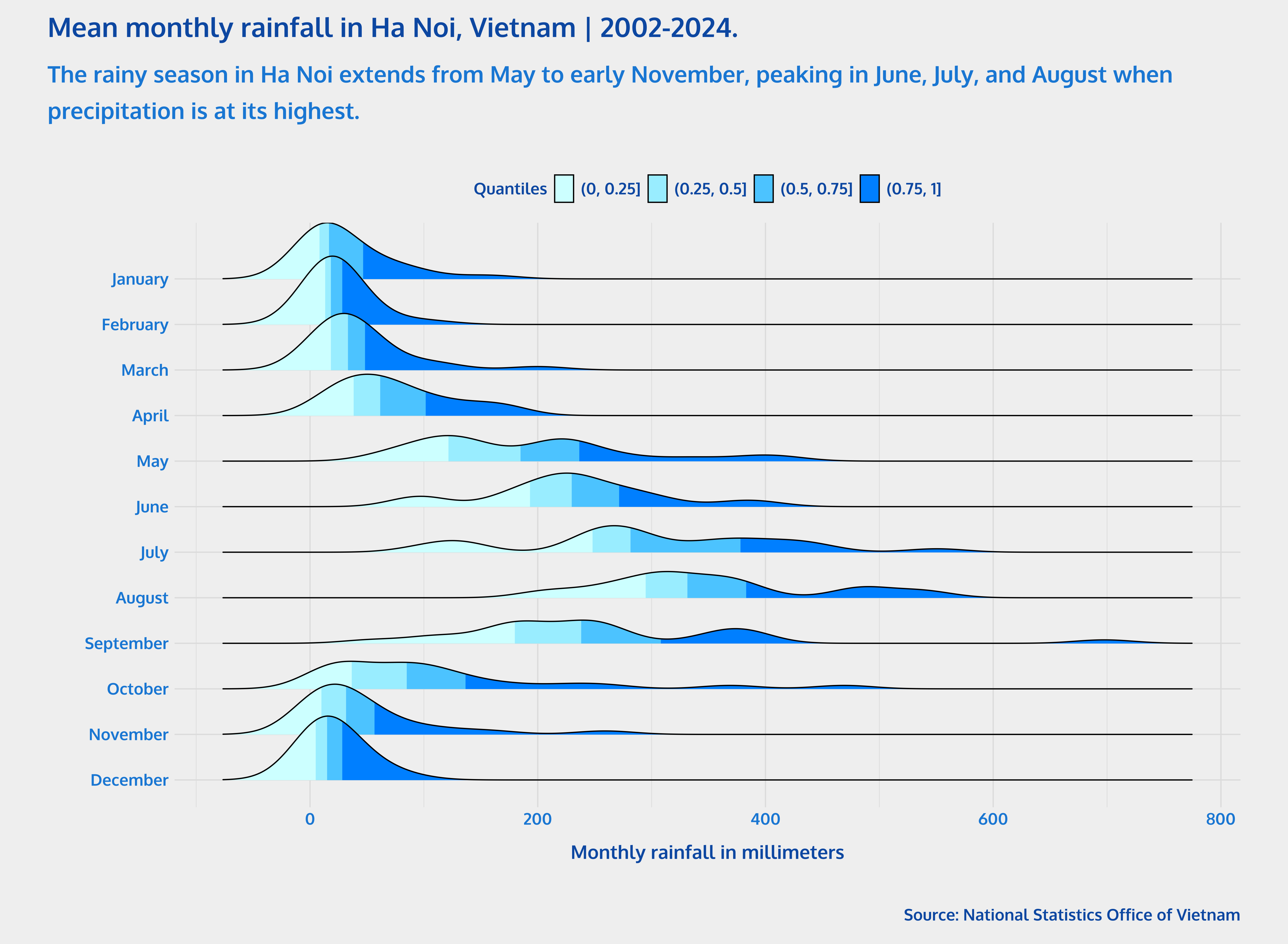
Ridgeline plots are a type of chart that displays the distribution of a numeric variable for different categories. These plots are commonly used to visualize changes in distributions over time. To showcase how to create ridgeline plots with {ggplot2} and {ggridges} in R, I will use data on monthly rainfall at some stations by provincies and month in Vietnam, from 2002 to 2024.

Data VisualizationOfficial StatisticsMexicoHousehold SurveysENVIPESocial Science
Published

Population pyramids are a powerful way to visualize demographic data, especially when analyzing age and sex patterns. In this post, I will elaborate a population pyramid using the {ggplot2} package in R, specifically focusing on crime victimization data from Mexico’s National Survey of Victimization and Perception of Public Safety ( Encuesta Nacional de Victimización y Percepción sobre Seguridad Pública , ENVIPE).

Data VisualizationDomestic ViolenceCambodiaGgplot2Social Science
Published

According to official data from the National Institute of Statistics of Cambodia, in 2009 about 77 percent of Cambodians aged 15–49 considered it acceptable for a man to curse his wife. Although this figure is high, it represents a decrease of about 16 percentage points compared to the previous estimate from 2005. Analyzing these changes is important for gaining a better understanding of the phenomenon of violence against women and girls.

Data VisualizationIntimate Partner Violence (IPV)TidyverseGgplot2ShapefilesSocial Science
Published

According to the 2021-22 Domestic Violence module of the Kingdom of Cambodia’s Demographic and Health Survey (CDHS), over 21% of Cambodian women aged 15–49 who have ever had a husband (or intimate partner), have experienced physical, sexual, economic, and/or emotional intimate partner violence in their lifetime.

Data VisualizationArmed ConflictACLEDLake Chad BasinNigeriaSocial Science
Published

ACLED (Armed Conflict Location & Event Data Project) provides detailed data on political violence and protest events across the globe. This blog post explores the visualization of armed conflict in the Lake Chad Basin, focusing on the dynamics of violence against civilians in the region.

Data VisualizationDroughtTidyverseGgplot2ShapefilesSocial Science
Published

Previously, in Part 1 of this tutorial, we calculated the Standardized Precipitation Index (SPI) for different time scales using the {SCI} package in R. Now, we will map the SPI values for the districts of Somalia using {sf} and {ggplot2} packages in R.

Data AnalysisDroughtTidyverseGgplot2Box PlotsSocial Science
Published

The Standardized Precipitation Index (SPI) quantifies how precipitation deviates from the historical average over multiple time scales (e.g., from 1 to 12 months), allowing for consistent monitoring of droughts and floods across regions and time, making it a valuable tool for early warning and risk assessment systems.

Data AnalysisOfficial StatisticsMexicoHousehold SurveysENVIPESocial Science
Published

In this article, I will guide you through the process of analyzing Mexico’s 2024 National Survey of Victimization and Perception of Public Safety ( Encuesta Nacional de Victimización y Percepción sobre Seguridad Pública , ENVIPE) using the {tidyverse} framework for survey analysis with the {srvyr} package.