Data VisualizationDisease OutbreaksEpidemicsPandemicsTidyverseSocial Science
Published
Author Juan Armando Torres Munguía
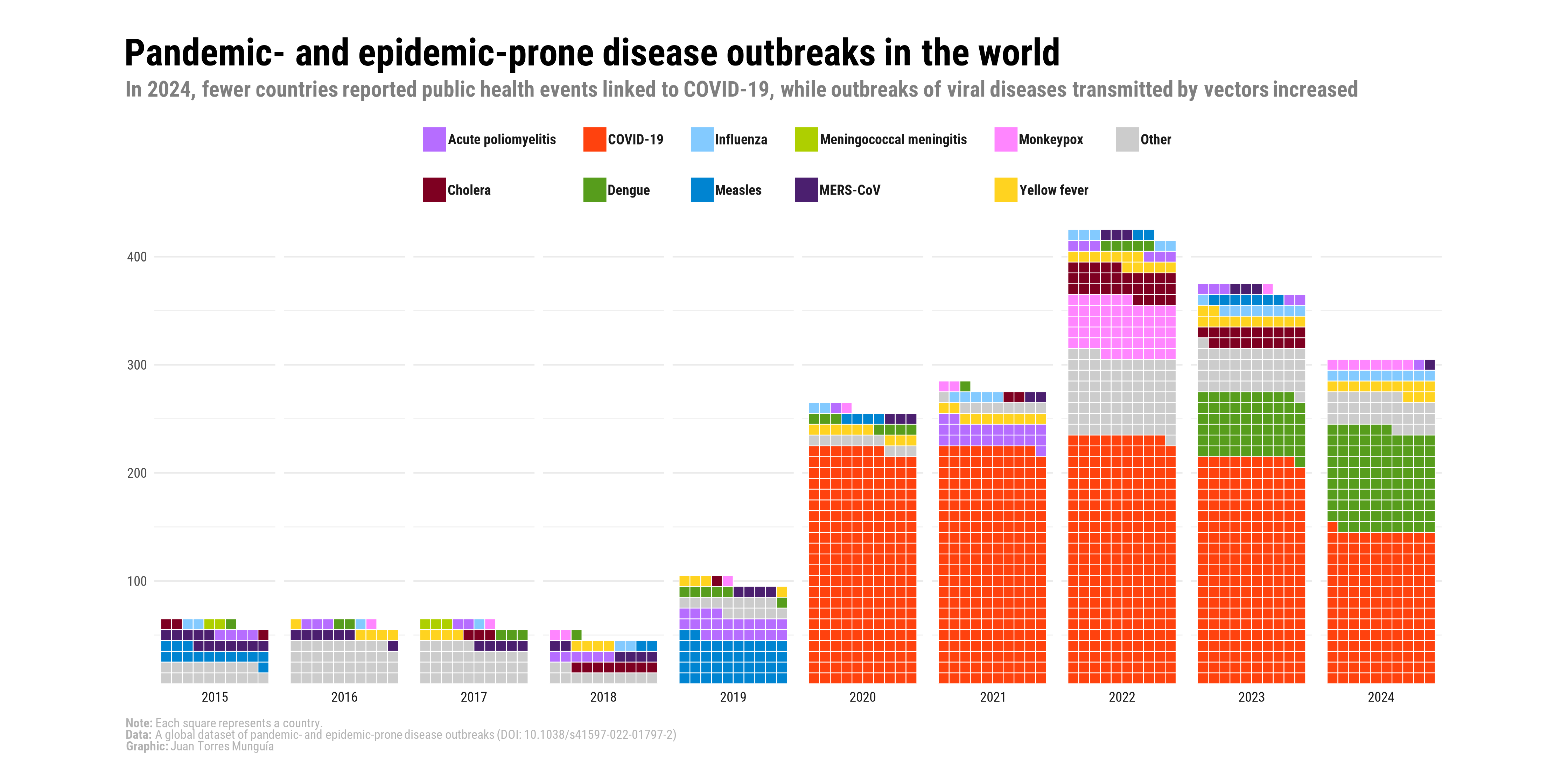
In these notes, I will show you how to use {ggplot} to create a waffle chart about the frequency of disease outbreaks in the world.