SpatialGeocomprRstatsVisSilGeowissenschaftenEnglisch
Veröffentlicht
Autor Jakub Nowosad
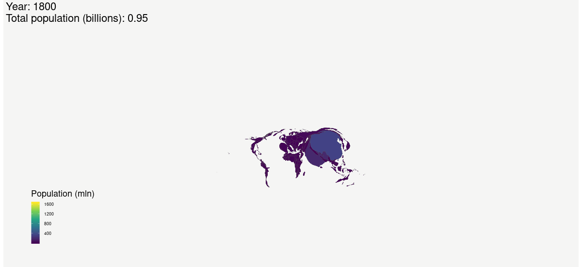
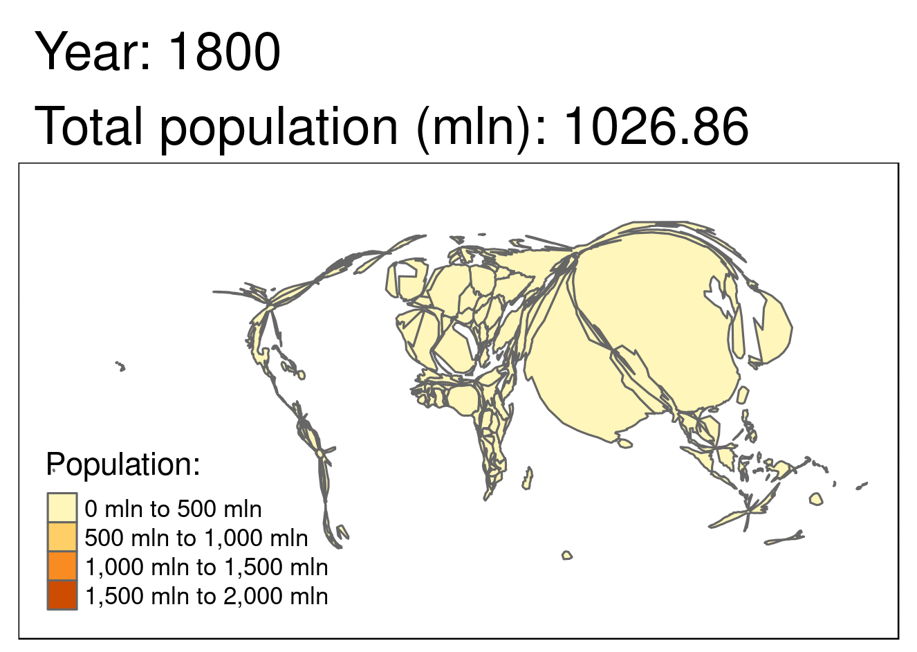
A few months ago I have made an attempt to visualize the world population changes from 1800 to 2100: {{% tweet "1049685831475187712" %}} This way of visualization is good to show the ever-changing distribution of the population on a global scale. It allows seeing that, China and India dominated the world population, but also a large share of the world population had lived in Europe in 1800.