RQuartoMarkdownCiência políticaInglês
Publicados
Autor Andrew Heiss
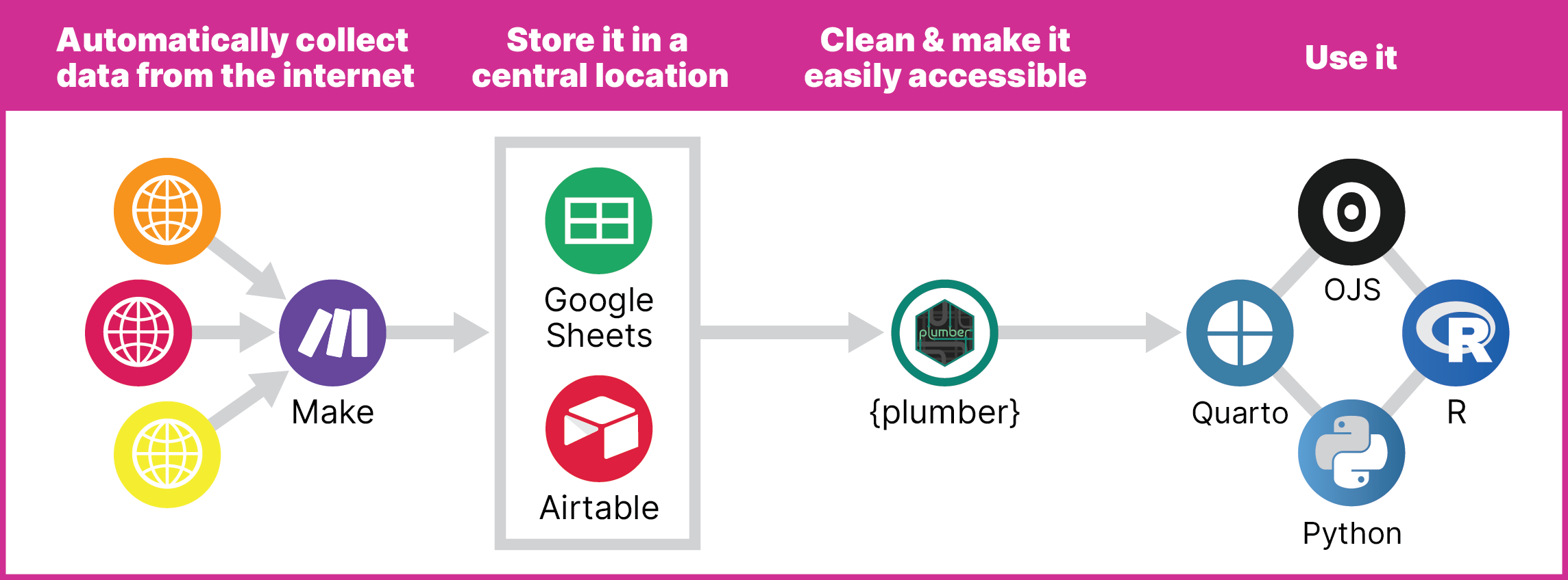
This year, I’ve helped build the Idaho Secretary of State’s office’s election results website for both the primary and general elections. Working with election data is a complex process, with each precinct reporting results to their parent counties, which all use different systems and software and candidate identifiers.