We have a new preprint out – it is a cautionary tale about using GFP nanobodies in cells. This short post gives a bit of background to the work. Please read the paper if you are interested in using GFP nanobodies in cells, you can find it here.

We have a new preprint out – it is a cautionary tale about using GFP nanobodies in cells. This short post gives a bit of background to the work. Please read the paper if you are interested in using GFP nanobodies in cells, you can find it here.
Anyone that maintains a website is happy that people out there are interested enough to visit. Web traffic is one thing, but I take greatest pleasure in seeing quantixed posts being cited in academic papers.

Our lab is international. People born all over the world have come to work in my group. I’m proud of this fact, especially in the current political climate. I’ve previously used the GoogleMaps API to display a heat map on our lab webpage. It shows where in the world people in the lab come from.

I read this recent paper about very highly cited papers and science funding in the UK. The paper itself was not very good, but the dataset which underlies the paper is something to behold, as I’ll explain below.

This week Erick Martins Ratamero and I put up a preprint on vesicle packing. This post is a bit of backstory but please take a look at the paper, it’s very short and simple. The paper started when I wanted to know how many receptors could fit in a clathrin-coated vesicle.

I saw today on Twitter that a few labs were examining the gender balance of their papers and posting the ratios of male:female authors. It started with this tweet. This analysis is simple to perform, but interpreting it can be hard. For example, is the research group gender balanced to start with?
This is a quick “how to” post. There is a licensed version of PyMol (MacPyMol) available, but the open source version can be installed on a Mac free of charge. The official page has a guide, which is not terribly detailed, and I found this excellent guide which is unfortunately out-of-date.

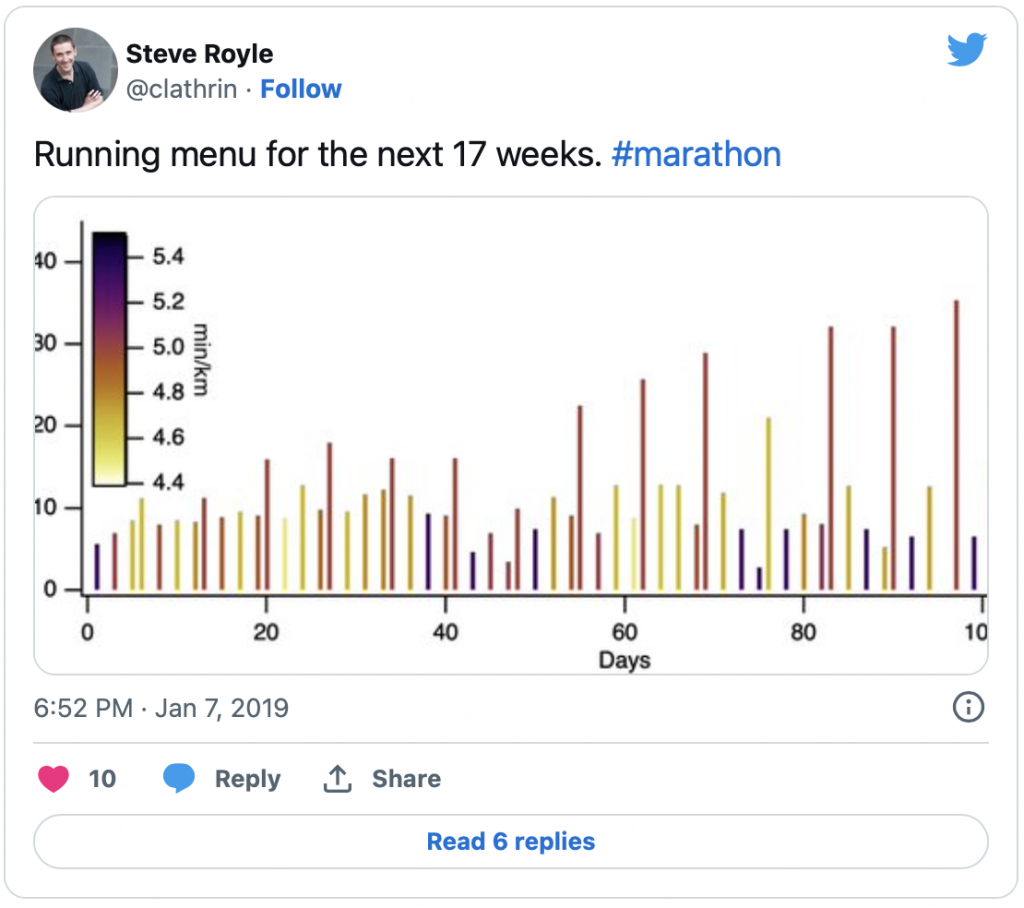
On a whim a posted a plot on Twitter. It shows a marathon training schedule. This post explains the story behind the graph. I downloaded a few different 17-week marathon training schedules. Most were in imperial measurement and/or were written for time at a certain pace, e.g. 30 min Easy Run etc.

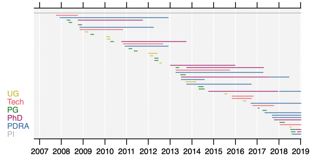
I really dislike being asked “how big is your lab?”. The question usually arises at scientific meetings when you are chatting to someone during a break.
Since I have now written several posts on this. I thought I would summarise the computer-based tools that we are using in the lab to automate our work and organise ourselves.

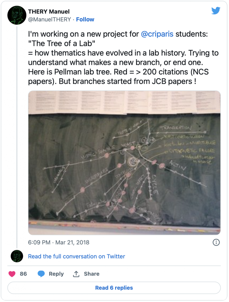
This post is about a citation analysis that didn’t quite work out. I liked this blackboard project by Manuel Théry looking at the influence of each paper authored by David Pellman’s lab on the future directions of the Pellman lab.