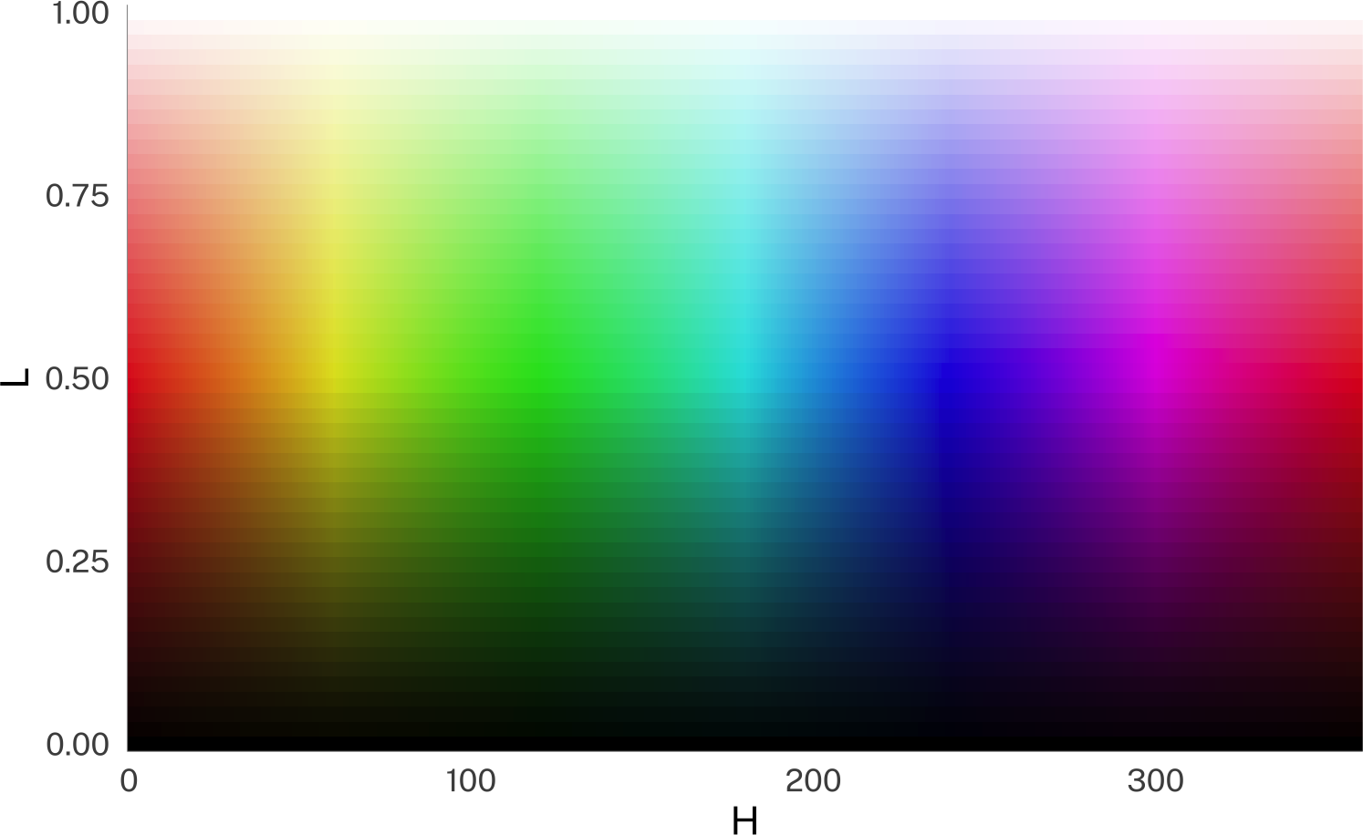
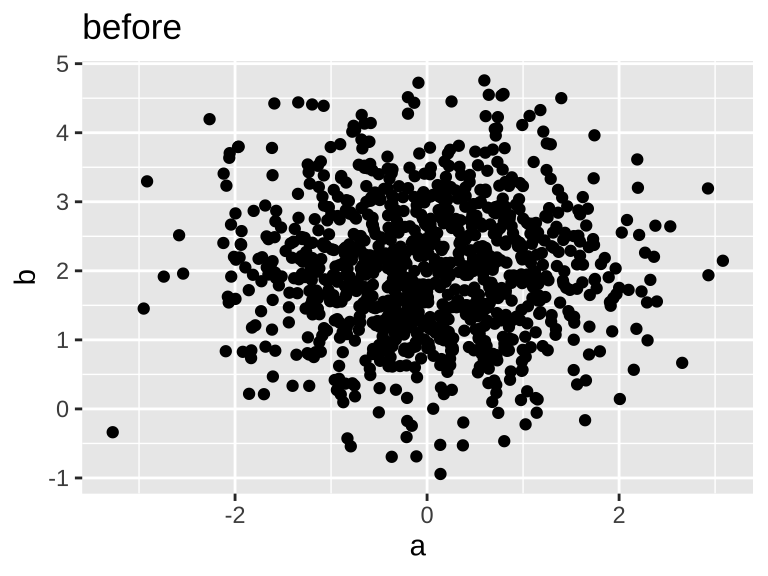
So now I can finally get to visualizing the effect of “light” and other modifiers on colors! When I eventually get to the plotly code, there’s nothing tidy going on, so I’ll be code-folding most of this stuff.

This tidytuesday dataset of colors labels is like the perfect confluence of interests for me! I’ve started learning how to do digital art to illustrate characters for a D&D campaign: Which means I’ve been looking a lot at a color picker that uses Hue, Saturation and Lightness sliders (even though they’re not labelled that way). But I’ve had an interest in colors and color theory for a while.

When I saw that the TidyTuesday dataset was the the XKCD color survey this week, I had to jump in! source(here::here("_defaults.R")) library(tidyverse) library(tidytuesdayR) library(tinytable) library(mgcv) library(marginaleffects) library(ggdist) library(ggdensity) library(geomtextpath) set.seed(2025-07-08) # eval: false # downloading &

Yesterday I posted about the normalization functions in the tidynorm R package. In order to implement formant track normalization, I had to also put together code for working with the Discrete Cosine Transform (DCT), which in and of itself can be handy to work with.

The upshot The tidynorm package has convenience functions for normalizing Point measurements norm_barkz() norm_deltaF() norm_lobanov() norm_nearey() norm_wattfab() Formant Tracks norm_track_barkz() norm_track_deltaF() norm_track_lobanov() norm_track_nearey() norm_track_wattfab() DCT coefficients norm_dct_barkz() norm_dct_deltaF() norm_dct_lobanov() norm_dct_nearey() norm_dct_wattfab() As well as generic functions to implement your

By default in a quarto document, the code and output look something like this: set.seed(2025) rnorm(10) [1] 0.62075674 0.03564140 0.77315448 1.27248909 0.37097543 -0.16285434 [7] 0.39711189 -0.07998932 -0.34496518 0.70215136 Maybe this is just me not wanting my peas to touch my mashed potatos, but I don’t like how close the output is to the text of the document.
Weinreich, Labov, and Herzog (1968) is a foundational text in my subfield of linguistics. Entitled “Empirical foundations for a theory of language change,” it’s both a comprehensive review of the field at the time, and a programmatic outlook for the future, laying down problems that researchers are still grappling with today.
Today in my stats class, my students saw me realize, in real-time, that you can include random intercepts in poisson models that you couldn’t in ordinary gaussian models, and this might be a nicer way to deal with overdispersion than moving to a negative binomial model.
For me, teaching stats this semester has turned into a journey of discovering what the distributional and ggdist packages can do for me. The way I make illustrative figures will never be the same. So I thought I’d revisit my post about hierarchical variance priors, this time implementing the figures using these two packages.

This might be a “everyone else already knew about this” thing, but I’ve finally gotten to a place of understanding about setting default colors scales for ggplot2, so I thought I’d share.

Recently, for class notes on probability/the central limit theorem, I wanted to recreate the table of 2d6 values that I made here. A really cool thing I found between that blog post and now is that gt has afmt_icon() operation that will replace text with its fontawesome icon.