Data VisualizationDisease OutbreaksEpidemicsPandemicsTidyverseInglés
Publicado
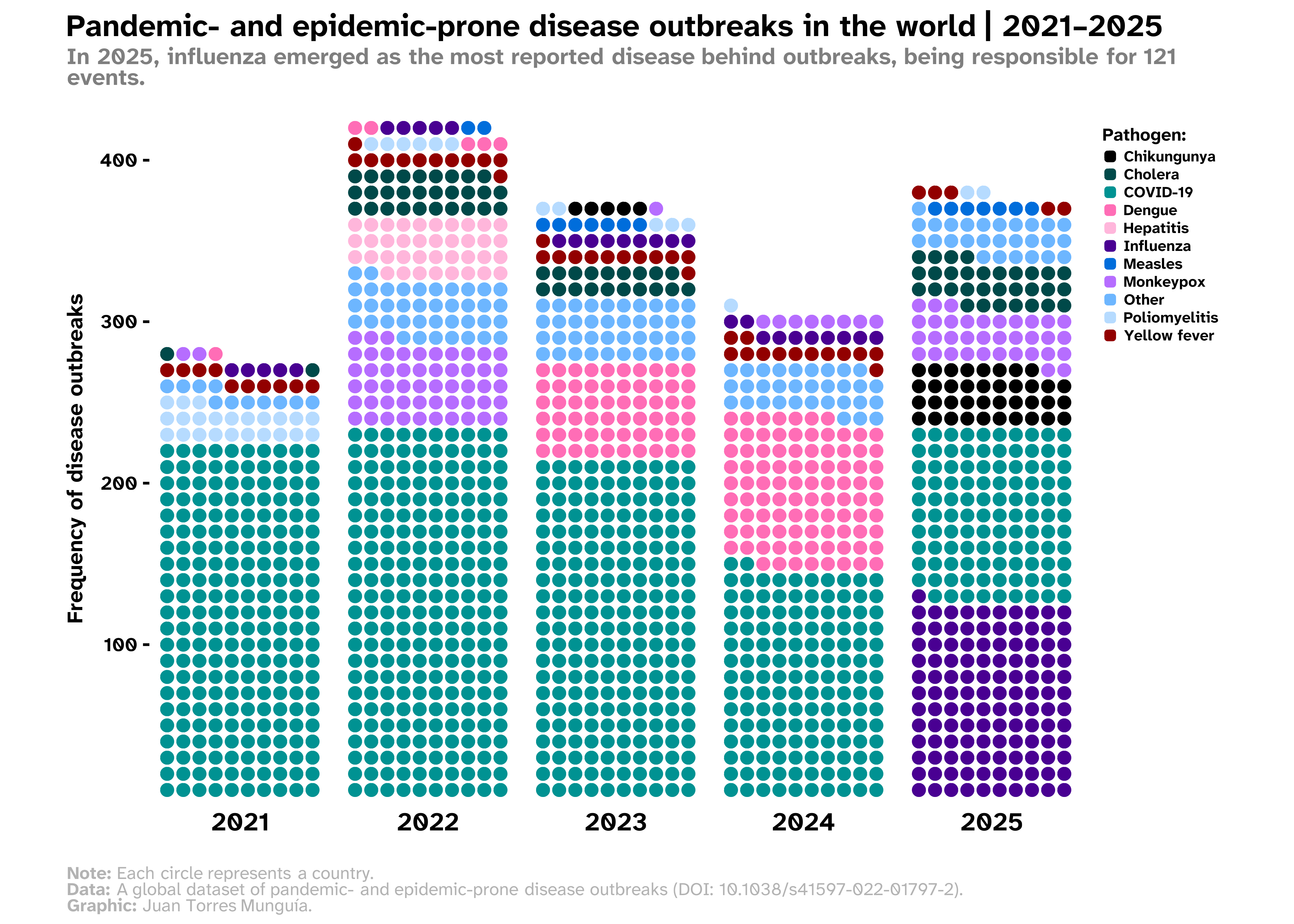
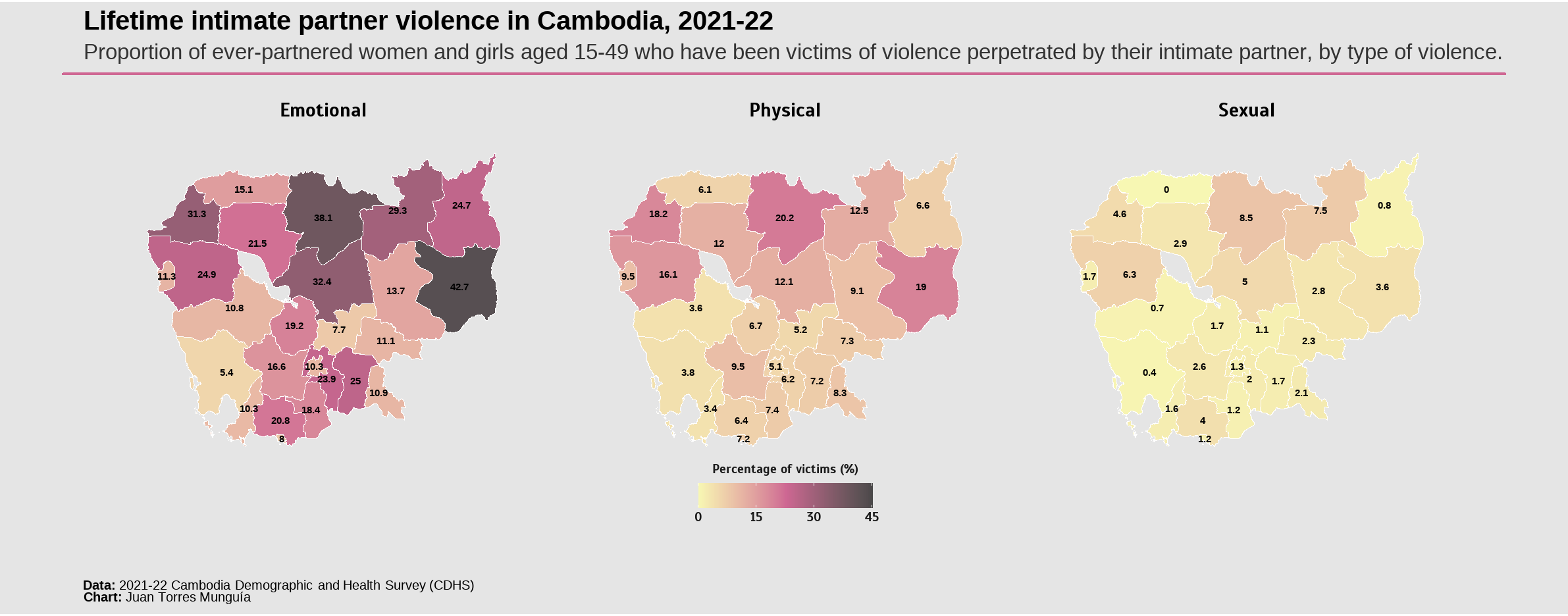
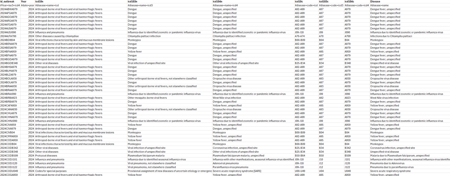
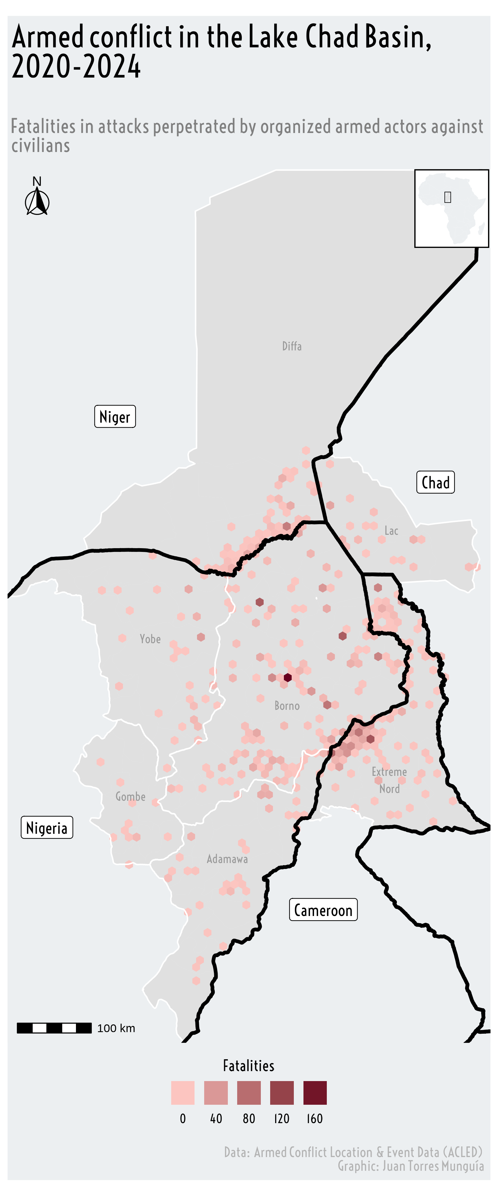
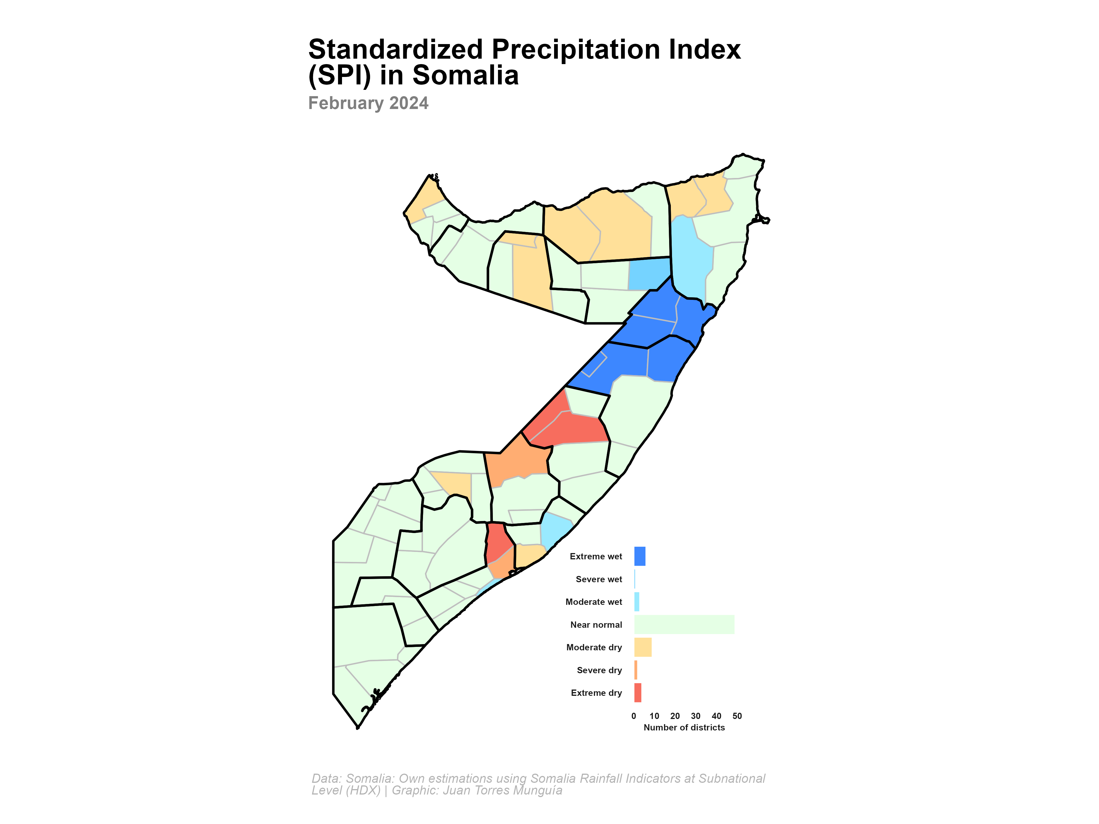
Overview Waffle charts are a useful way to visualize part-to-whole relationships. Commonly, waffle charts depict a grid of regular squares to represent the distribution of a categorical variable. Previously, in a post on this Blog, I built the following waffle chart to visualize disease outbreaks in the world between 2015 and 2024.